On a lovely weekend morning, I’ve been searching the web for a hotel towards my vacation in New-York city with my beloved wife. After so many years, we were thinking on traveling during the holiday season and started planning three months ahead. Booking.com was my first step on my quest to find the perfect hotel.
Five minutes of browsing on Booking.com stressed me up like I’ve never felt before!
It felt like I was about to miss the last room available in New-York and that my vacation was under a major risk, which might not have been well received by my wife.
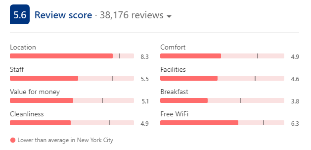
Booking overwhelmed me with 32 different messages all aimed to ensure I would complete the reservation as fast as possible. All presented within just 4 web pages, for a single hotel search! I was panicking, my vacation was at risk, I almost settled on the first hotel I viewed that got a very low review score of 5.6 out of 10!
At that time, I couldn’t say if this hotel was my best option, yet I was on the verge of purchasing without even checking other options. This was exactly what booking wanted me to feel.
Eventually I found a different, much better hotel for me on Booking, but the feeling of almost being tricked stayed a long time afterwards. After calming down I asked myself if this is how eCommerce should look like, if Booking team found a genius formula to increase conversion or if this stressful experience eventually drives buyers away.
For me the answer is clear, they have a genius buying experience!
I believe they found the right balance between urging the users to make the order (“booked 8 times today”, “last room available”, “7 other people are viewing this hotel”) and reassuring them that they are doing the right thing (“recommended for you”, “we price match”, “free cancellation”…). This, along with some great features that the site offers (like a great map view and in-app communication options with the hotel) give us exactly what we need and eventually drive us to order.
The journey that stressed me up
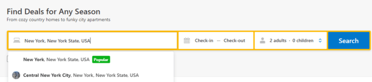
My 5 minutes journey on Booking.com started on their home page, searching a hotel in New-York. Before I had the chance to fill the relevant dates, I was already warned that New-York is “Popular” (#1).
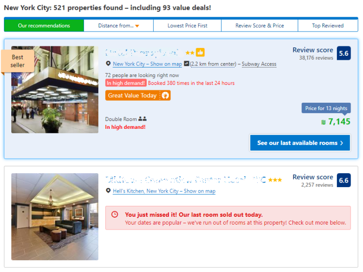
I felt very happy that I was going to a popular place and clicked Search. The search results page presented 2 results only, and I had to scroll down to see the rest of my options. The first result was marked as “Best Seller” (#2) highlighted with a grey background and a blue border (#3) and the second result was “Sold Out” (#4) which only purpose was to make me to hurry up under the assumption that all rooms are getting booked.
So I’ve taken a closer look at the first result (that was obviously promoted). I was told the hotel was “In high demand” (#5), “Booked 380 times in the last 24 hours” (#6), it was a “Great Value Today” (#7) and that I should see the “Last available rooms” (#8).
I had to check this first hotel because it was about to run out of rooms. I clicked on it and entered the hotel’s page.
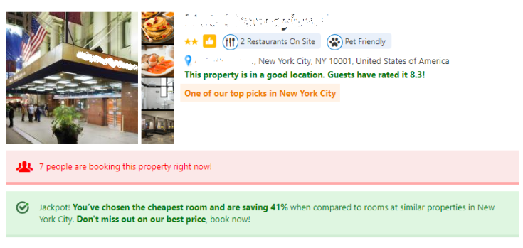
In the most visible property in the page, right next to the hotel name, I got all the reasons why this hotel was best for me: the blue ribbon icon stated it was an “excellent choice for couples” (#9),”thumbs up” icon (#10) gave me the confidence that this hotel was great, personalized message “Great for Two Travelers” (#11), and the link to the map feature also stated it was in a “Great location” (#12).

Another very important section in this page is the image section. Here Booking presents the positive reviews only (#13), and emphasizes the ones with the highest score, such as – “Great Location 8.3” (#14). Booking also continues to urge me with red messages of “Only 1 room left” (#15) and “One of our top picks in New-York City” (#16).
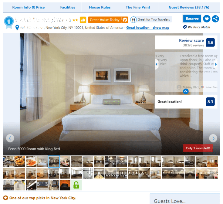
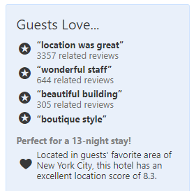
Scrolling down a bit, the good reviews (#17) are presented again.
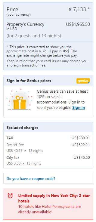
I’ve reached the stage where I was ready to check the prices. So I scrolled down to view them. Don’t be confused, it is fully intentional. Booking wants us to absorb all this information before getting to the (usually) most important thing – the cost.
On the price section we have many red and green messages- the reds are to push us to action and the greens are to make us feel that the alternative options are great as well. Not surprisingly the red messages are mostly visible on the most relevant room for me (for couples). So I was notified that “Someone just booked this” (#18), “Jackpot for cheapest price in New-York” (#19) and that “You got a great rate” (#20). I was also notified that at the moment I was competing with “73 other people” (#21).
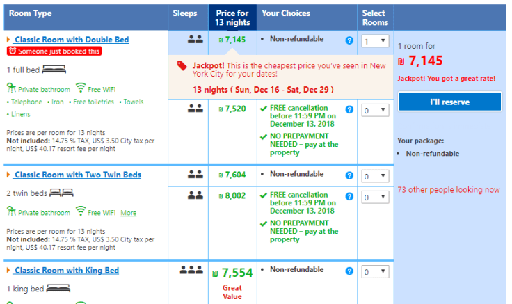
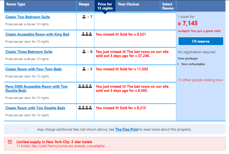
At the bottom of the prices section, Booking reminded me that there were many sold out rooms (#22) and that “New-York has limited supply of hotels” (#23) so I should not take my time and would harry up to complete the purchase.
After choosing my preferred room, I was redirected to the most important page from Booking perspective – the checkout page.
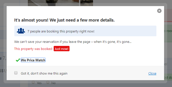
But just before that I got a popup message, reminding me that they “can’t save my reservation” (#24), that “7 people are booking it now” (#25), it was “just booked” (#26) and that Booking is matching lower prices (#27) to give me the feeling it was the lowest price (who really checks this?),
After closing this popup, I hurried up to pay Booking before it is too late. The checkout started with the hotel details and a short summary assuring me this hotel was great like, “the property is in a good location” (#28), “One of our top picks in New-York City” (#29), “7 people are booking this property right now!” (#30) and last a nice green supportive message that stated that I won the Jackpot and save 41% (#31).
Right before checking out I always check the total price on the left side. The total price was presented in big letters, and below that a notice of an additional 43% excluded charges written in small letters, separated with a promotion ad to Booking customer club and afterwards, before I had the chance to change my mind, I got another red message reminding me of “Limited supply in New-York” (#32).
After this very stressful experience, I finally had the chance to complete my purchase and surprisingly I felt so happy with myself. I got what I wanted before other shoppers had the chance to reserve all rooms available.
To summarize
By reading my stressful experience you might think that I criticize Booking, on the contrary, from eCommerce management perspective such experience can yield high conversation and purchase rates. Being able to prevent the customer from leaving the site is a very difficult task and I believe Booking is doing very well in that aspect.
From emotional perspective, this experience is like going on a roller-coaster, it is stressful all the way to the end but eventually you finish with a smile on your face. This emotional experience with a happy ending is what will make you return next time. Doing that is also very hard to achieve in just 5 minutes.
I do think that Booking exaggerates with way too many messages, some are unclear, and some are promoted too aggressively.
To sum it up. from eCommerce perspective they are Genius to my opinion. Because they dare to do things that I haven’t seen anywhere else. I admire the decision makers on Booking buying experience.
Any eCommerce site can learn a lot from Booking, including the big ones like Amazon and eBay. Of course selling services is different from selling physical products, but the state of mind when building an eCommerce buying experience is very much alike.
Great work Booking!
Ori Feldstein is a senior manager, experienced in eCommerce and in management of multi-million dollars programs in several industries – Big data, e-commerce and Defense. He is a co-founder of two family owned websites in the B2B eCommerce of chemicals (cheta.biz ; chemcenters.com). Follow him on Linkedin, @ori-feldstein.

Leave a comment